Choosing calm colors for your home can make each room feel more comfortable, balanced, and inviting. Soft colors often create a relaxed atmosphere, but the best choice depends on your home’s natural light, furniture, room size, and personal style.
Calm does not have to mean plain or boring. The right combination of gentle neutrals, muted blues, soft greens, warm whites, and natural tones can add personality while keeping a peaceful look. Use the following tips to create a color palette that feels soothing and works well throughout your home.
Start With the Feeling You Want
Before choosing paint or accessories, think about how you want the room to feel. A bedroom may benefit from colors that encourage rest, while a living room might need a calm but welcoming atmosphere.
Consider words that describe your ideal space:
– Peaceful
– Light
– Cozy
– Fresh
– Warm
– Airy
– Balanced
– Natural
These words can guide your choices. For example, soft blue and pale green often feel fresh and restful, while warm beige, cream, and muted tan can make a room feel comfortable and grounded.
It also helps to consider the room’s purpose. A home office may need a quiet, focused feeling, while a dining area can include slightly warmer shades to create a friendly setting.
Choose a Gentle Base Color
A base color covers the largest areas of a room, such as the walls, ceiling, or large built-in features. For a calm design, select a shade that is soft and easy to live with.
Popular calm base colors include:
– Warm white
– Soft beige
– Light gray
– Pale blue
– Muted green
– Light taupe
– Soft sand
Warm whites and creams can make a space feel bright without appearing cold. Light gray offers a clean, modern look, while beige and taupe add warmth. Pale blue and muted green can bring a natural feeling to bedrooms, bathrooms, and living spaces.
When selecting a neutral, pay attention to its undertone. Some whites and grays have blue or green undertones, which can make them feel cool. Others have yellow, red, or brown undertones, creating a warmer appearance. Try to match the undertone to your flooring, furniture, and lighting.
Consider Natural and Artificial Light
Lighting can significantly change how a color looks. A shade that appears soft and warm in a store may look cooler or darker in your home.
Rooms with large windows and strong natural light can handle slightly deeper or cooler colors. In darker rooms, warm neutrals and light shades may help the space feel more open.
Think about the direction of the windows as well:
– North-facing rooms often receive cooler, softer light.
– South-facing rooms usually receive warmer and brighter light.
– East-facing rooms may look bright in the morning and subdued later.
– West-facing rooms often have warmer light in the afternoon and evening.
Artificial lighting also affects color. Warm bulbs can make beige, cream, and tan appear richer. Cooler bulbs may emphasize blue or gray tones. Test your color samples at different times of day so you can see how they change.
Use the Three-Color Approach
A simple way to build a calm palette is to use three related colors:
- A main color for walls or large surfaces
- A supporting color for furniture, curtains, or rugs
- An accent color for smaller details
For example, you could pair soft warm white walls with light taupe furniture and muted sage green accents. Another option is pale blue walls, natural wood furniture, and cream textiles.
The colors do not need to match exactly. They should simply work well together and share a similar level of softness. Avoid combining too many strong colors, as this can make a peaceful room feel busy.
Explore Soft Blue and Green
Blue and green are often associated with nature, water, trees, and open skies. Their muted versions can create a calm atmosphere without feeling dull.
Soft blue works well in:
– Bedrooms
– Bathrooms
– Reading corners
– Home offices
Look for dusty blue, misty blue, blue-gray, or pale denim shades. These colors pair nicely with white, cream, light wood, and natural fabrics.
Muted green can add warmth and character while still feeling restful. Consider sage, eucalyptus, olive-gray, or soft moss. These shades work especially well with warm neutrals, woven materials, and houseplants.
If you are concerned that blue or green may feel too cool, balance them with wood tones, brass details, cream fabrics, or warm lighting.
Add Warm Neutrals for Comfort
Warm neutrals can make a home feel relaxed and welcoming. Shades such as sand, oatmeal, camel, mushroom, and light brown work well in living rooms, entryways, and open spaces.
These colors are especially useful when you want a calm look that does not feel overly cool or stark. They also provide a flexible background for changing artwork, pillows, and seasonal accessories.
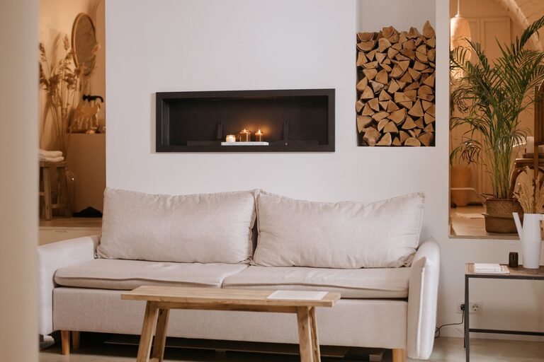
Natural materials can reinforce the effect of warm colors. Try combining a soft beige wall with:
– Light wood furniture
– Linen curtains
– Woven baskets
– Wool or cotton rugs
– Ceramic accessories
– Neutral artwork
This combination creates visual interest through texture rather than strong color contrast.
Keep Color Flow Between Rooms
In an open floor plan, colors should feel connected. You do not need to use the same shade everywhere, but each room should relate to the next.
One approach is to choose a whole-home palette with a consistent undertone. For example, you might use warm white in the main living area, pale beige in the hallway, and muted sage in the bedroom. The colors are different, but they share a gentle, warm quality.
You can also repeat small details throughout the home. A blue-gray pillow in the living room, a similar picture frame in the hallway, and a soft blue vase in the bedroom can create a subtle connection.
Test Samples Before Making a Decision
Never rely on a small color card alone. Paint a sample on several areas of the wall or use large sample boards that you can move around the room.
Observe the samples:
– In morning light
– In afternoon light
– In the evening
– With the room’s lights on
– Next to flooring and furniture
Look at the color from different distances as well. A shade may appear pleasant up close but feel too dark or too bright when viewed across the room.
Give yourself a few days to live with the samples. This helps you notice how the color feels during different activities and times of day.
Use Stronger Colors in Small Doses
Calm homes can still include color and personality. If you enjoy deeper shades, use them in smaller areas rather than covering every wall.
Try adding richer colors through:
– Throw pillows
– Artwork
– Lampshades
– Curtains
– Accent chairs
– Bed linens
– Decorative objects
Deep navy, muted terracotta, forest green, or dusty rose can add interest while remaining comfortable when used carefully. Repeating one accent color in several small details can make the room feel intentional.
Pay Attention to Finish and Texture
The paint finish can affect how a color appears. Matte and low-sheen finishes tend to create a soft, understated look, while satin or semi-gloss finishes reflect more light and may make colors appear brighter.
Texture is also important. A calm room should not rely on color alone. Layering different materials can make a simple palette feel complete. Combine smooth walls with woven baskets, soft rugs, textured blankets, wood, glass, or ceramics.
Create a Palette That Feels Like You
The most successful color palette is one that suits your home and your daily life. Browse rooms you enjoy and look for patterns in the colors you choose repeatedly. You may prefer warm neutrals, cool coastal shades, earthy greens, or a mix of soft tones.
Start with one color you love, then build around it using lighter, darker, or more muted versions. Keep the overall palette simple, test your choices carefully, and allow texture to provide variety.
With thoughtful planning, calm colors can make your home feel more comfortable, cohesive, and welcoming without sacrificing character.
About the Author